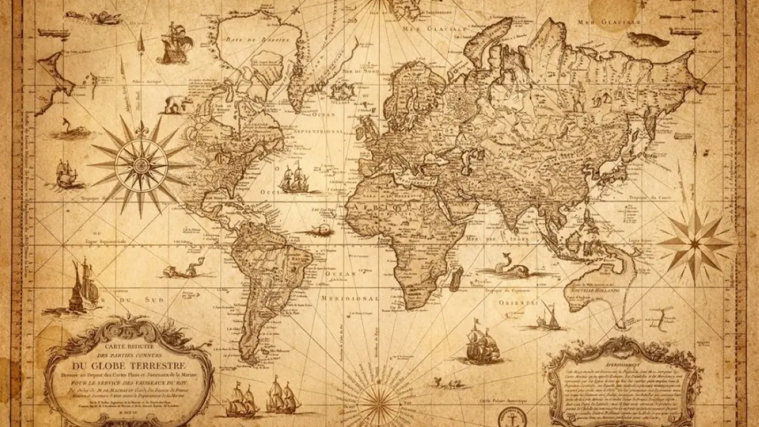
On 4 September, the UN General Assembly passed a resolution called "Correct the Map", spearheaded by Togo and the African Union. The vote was emphatic: 164 in favour, one against, six abstentions. Nothing on the ground changed — Africa didn't grow. What changed is a growing consensus that the world map most of us grew up with massively distorts reality.
The culprit is the Mercator projection, devised in 1569 as a navigational tool. It's brilliant at preserving compass bearings, which is why sailors loved it. But to flatten a sphere into a rectangle, Mercator stretched the poles and compressed the equator. The result: Greenland looks roughly the size of Africa, when in fact Africa is more than 14 times larger. Canada and Russia get a visual boost they never earned; equatorial regions shrink into apparent insignificance.
The resolution doesn't ban Mercator or dictate a replacement. It simply nudges governments, schools and — notably — tech companies to use equal-area projections like Equal Earth wherever relative size matters. Given how many billions of people now meet the world through a mapping app, that last part matters. Most of us never question the projection our phone serves up; we just absorb it.
The argument of the piece, by political scientist Faroukou Mintoiba, is that maps are never neutral. A continent that appears small and peripheral on classroom walls for centuries tends to be treated as small and peripheral — in media coverage, in geopolitics, arguably in travellers' imaginations too. Africa is often framed through a narrow set of narratives, and a map that visually downgrades the world's second-largest continent fits uncomfortably into that pattern.
For travellers, this is a practical prompt as much as a symbolic one. Africa's true scale is easy to underestimate: a trip that looks like a neat loop on a Mercator map can involve flying distances comparable to crossing an entire continent elsewhere. Nairobi to Cape Town is roughly the same as London to Tehran. Treating "Africa" as one destination, rather than 54 countries spanning deserts, rainforests, mountains and megacities, is partly a cartographic illusion.
The vote won't fix unemployment, conflict or investment gaps — the author is clear that a map can't do that. But symbols shape perceptions, and perceptions shape itineraries. If the map hanging in your mind suddenly shows Africa at true scale, the sheer size, diversity and possibility of the continent start to make a lot more sense.