
Most of us grew up staring at the same world map, and most of us were misled by it. The familiar Mercator projection — the one hanging in classrooms and pinned to office walls — stretches landmasses near the poles and compresses those near the equator. The result: Greenland balloons while Africa shrinks, even though Africa is roughly fourteen times larger than Greenland.
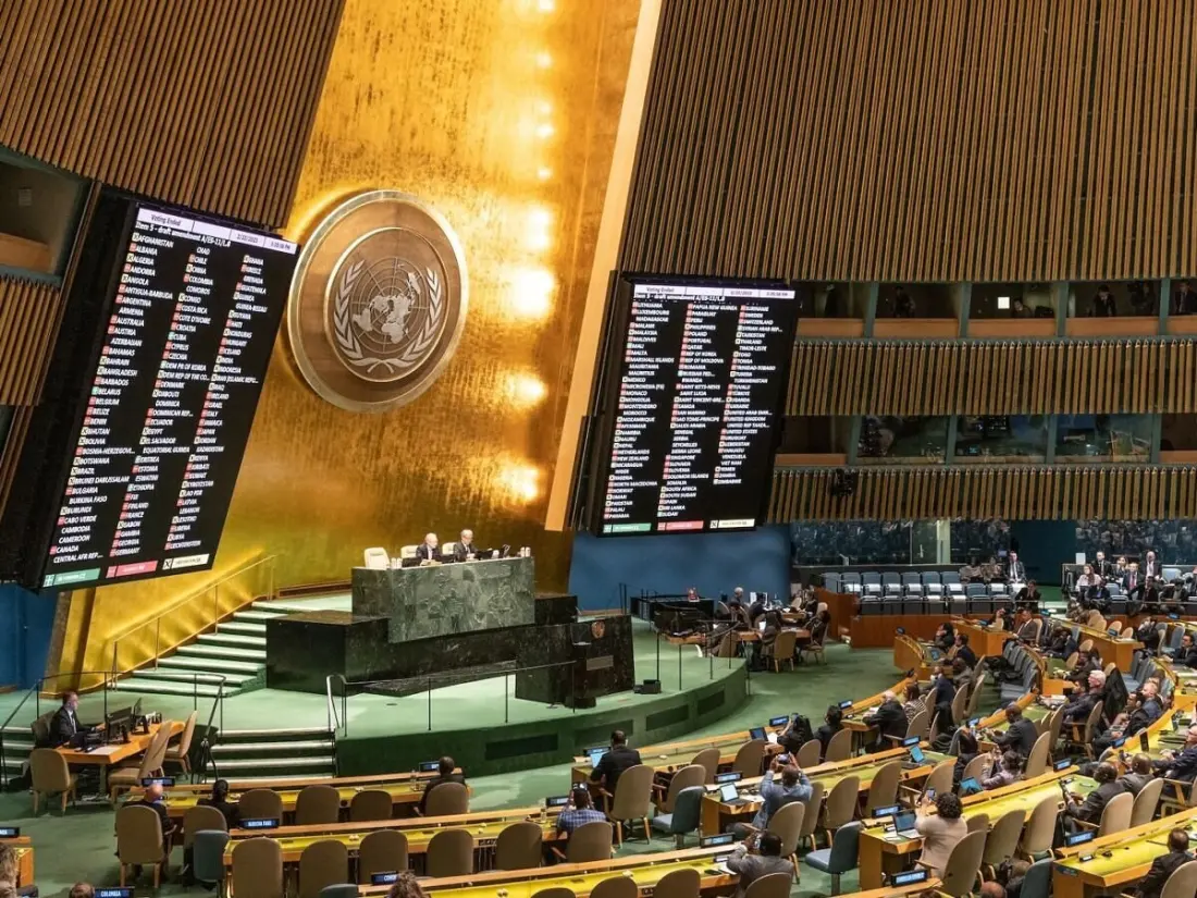
The United Nations General Assembly has now weighed in. On September 4, 2026, it voted 164 to 1 to adopt a resolution encouraging governments, schools and international organisations to use maps that show continents at their real relative sizes — naming the Equal Earth projection as a preferred option. The United States cast the lone vote against. Togo led the push on behalf of the African Group, with backing from the African Union, which argued in a March 2026 speech that the Mercator map's distortion leads people to underestimate Africa's economic, cultural and geopolitical weight.
Worth knowing: the resolution is nonbinding. Nothing is banned, and no one is forced to redraw every atlas. It simply nudges institutions toward equal-area projections where accurate size matters, while acknowledging that different maps suit different jobs.
There's a reason the Mercator map looks the way it does. Flemish cartographer Gerardus Mercator designed it in 1569 for navigation: on his map, a straight line equals a compass bearing, so sailors could plot a course with a ruler and hold it. That made sense in the age of sail. With GPS doing the heavy lifting now, the case for keeping a navigation tool as the world's default reference map has faded.
The Equal Earth projection itself is recent. Three cartographers developed it in 2018, spurred by the debate that erupted when Boston's public school district switched to the Gall-Peters projection — an equal-area map that gets sizes right but mangles shapes. Equal Earth keeps areas accurate while keeping continent shapes recognisable, which is why it has quietly gained traction: NASA's Goddard Institute has used it for global temperature maps since 2018, and the National Geographic Society relies on it for educational materials. The African Union adopted it in February 2026, and the UN followed within months.
Why should a traveller care? Because mental maps shape expectations. If you think Africa is a compact strip, a multi-country trip across the continent seems unmanageable — when in reality crossing it spans multiple climate zones and a distance comparable to crossing several continents elsewhere. An honest map changes how you plan routes, estimate travel times and appreciate the sheer scale of places like the Democratic Republic of Congo, Algeria or South Africa. For anyone booking a long-haul itinerary, especially in Africa or across the Pacific, it's a quiet but genuine upgrade in how we picture the planet.